Overview
Angels Unaware is a nonprofit in Tampa, FL, providing residential services for individuals with developmental disabilities.
In this project, we redesigned the website to improve navigation, organize information and application forms, and help users easily find the support they need

Meet the Team
Meet the team for this project!

Lily Ortiz
Project Manager

Antonia Gurkovska
UI Designer

Ariel Zhong
UX Designer
Problem Statement
In this project, we addressed key challenges faced by parents in Tampa seeking autism support services—such as fragmented information, long waitlists, and unclear enrollment—by redesigning the website for clarity, accessibility, and ease of use.

User Persona
We created a persona of a mother seeking timely residential services for her child with developmental disabilities, aiming to ensure proper care, support, and a stable living environment shortly after applying

Diverge and Converge
During the UX research and ideation phase for the Angels Unaware website, we used a Diverge/Converge approach informed by user insights to refine ideas into high-impact solutions, leading to a redesigned homepage navigation, a clearer application process guide, and an improved support section in our prototype..


Task Flow
After the Diverge/Converge process, we created a task flow and outlined assumptions for a simplified, straightforward application form to ensure users could complete it quickly and without confusion.

Ideation Process
With our ideas and research in place, we began creating wireframes to establish the redesigned layout and define the navigation structure for key features.

Mid Fidelity
In the mid-fidelity stage, we added more content, features, and icons to provide a clearer visual experience for usability and A/B testing.

Mobile Version
We also created a mobile version of the site, which mirrors the desktop layout but uses a hamburger menu to conserve screen space and maintain a clean interface.
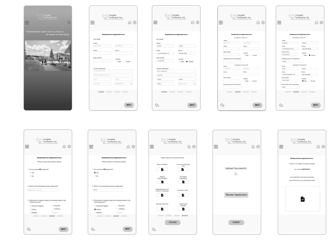
A/B Testing for Mobile Version
After creating the mobile version, we conducted A/B testing on the application form. Version A used a five-step format with 'Next' buttons for each section, while Version B was a single scroll-through form.
Results showed that Version A worked better for mobile due to its step-by-step clarity, while Version B was preferred on desktop, where the larger screen accommodated all content on one page.
Testing A
Testing B


High Fidelity
Based on A/B testing feedback, we updated the desktop application form to a single scroll-through format and added animation to the hero image to enhance visual engagement.
Get Started
Prototype

Outcome
The project resulted in a mid-fidelity prototype with improved navigation and content structure, addressing key user pain points. It strengthened my skills in designing for accessibility and emotional sensitivity. Future steps include live usability testing and refining the mobile experience..
